Thinking of giving an upside-down homepage a try?
This guide can help you get started.
Sometimes, short is sweeter — and that’s the case with this type of landing page. You’re stripping the design off of any fluff and leaving a clear path to getting your visitors to convert.
It’s also a cool way to grab people's attention and make sure they won't forget your site.
But creating an upside-down homepage is more than just flipping things around. You need to build a page that's not only super interesting but also easy for your visitors to use.
And this tutorial will help you achieve just that.
We’ve put together an easy step-by-step guide on how to make an upside-down homepage that looks amazing and works great.
This guide will help you from the start to the finish, making sure your homepage turns heads for all the right reasons.
Why Should You Give an Upside-Down Homepage a Try?
Sometimes, it pays to get straight to the point.
Most landing pages lead in with a big picture message or story to warm first-time visitors up before presenting an offer, in hopes of building enough interest to get them to take action.
But upside-down homepages offer a different approach.
This type of new homepage prioritizes conversions by leading with the call-to-action at the top of the page, and adding supporting elements further down.
This inverted layout means your new visitors are immediately met with what you most want them to see or do. It also gives the impression that you respect your visitors’ time and attention, understanding that not everyone wants to scroll through a lengthy page before figuring out what to do next.
Key benefits of this type of page include:
Immediate engagement: Visitors are instantly engaged with the most critical part of your message or offer. This can be especially effective for users visiting your site with a clear intention, ready to take action.
Higher conversion rates: By presenting the call-to-action upfront, you remove the risk of it being overlooked. This directness can lead to generating more email subscribers or customers, as the main action you want your audience to take is the first thing they see.
Simplified user journey: An upside-down homepage simplifies the decision-making process for your visitors. With less content to navigate before hitting a CTA, the path to conversion is shorter and more straightforward.
Focused messaging: This layout forces you to keep your messaging straightforward. This page has one goal and each element is a part of the roadmap to achieving it. So avoid adding unnecessary elements like a “Popular Articles” section or long blocks of in-depth text unless it’s completely necessary.
How to Design a High-Converting Upside-Down Homepage from Scratch
This step-by-step tutorial will guide you through the process of creating an upside-down homepage the easy way -- with Thrive Architect.
1. Download & Install Thrive Architect
Thrive Architect is the best landing page builder plugin for website owners who want to build and ship an impressive WordPress website fast.
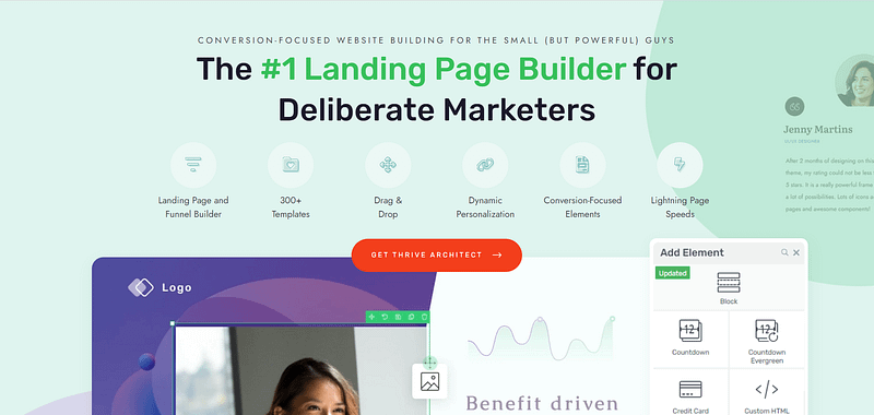
With its intuitive drag-and-drop interface, Thrive Architect saves you from struggling with complex code, making the creation of sleek landing pages – including unconventional pages like an upside-down homepage – a breeze.
Thrive Architect isn’t just easy to use; it's designed with your business growth in mind.
The tool is packed with features specifically geared towards generating leads and sales.
From standout call-to-action sections to drive conversions, to building trust with testimonial sections, every element is there to help you increase sign-ups and strengthen your credibility.
Plus, its seamless integration with leading email marketing and CRM platforms streamlines your workflow, allowing you to effortlessly automate your email sequences and keep your target market engaged.
But what really stands out is Thrive Architect's collection of professionally designed templates.
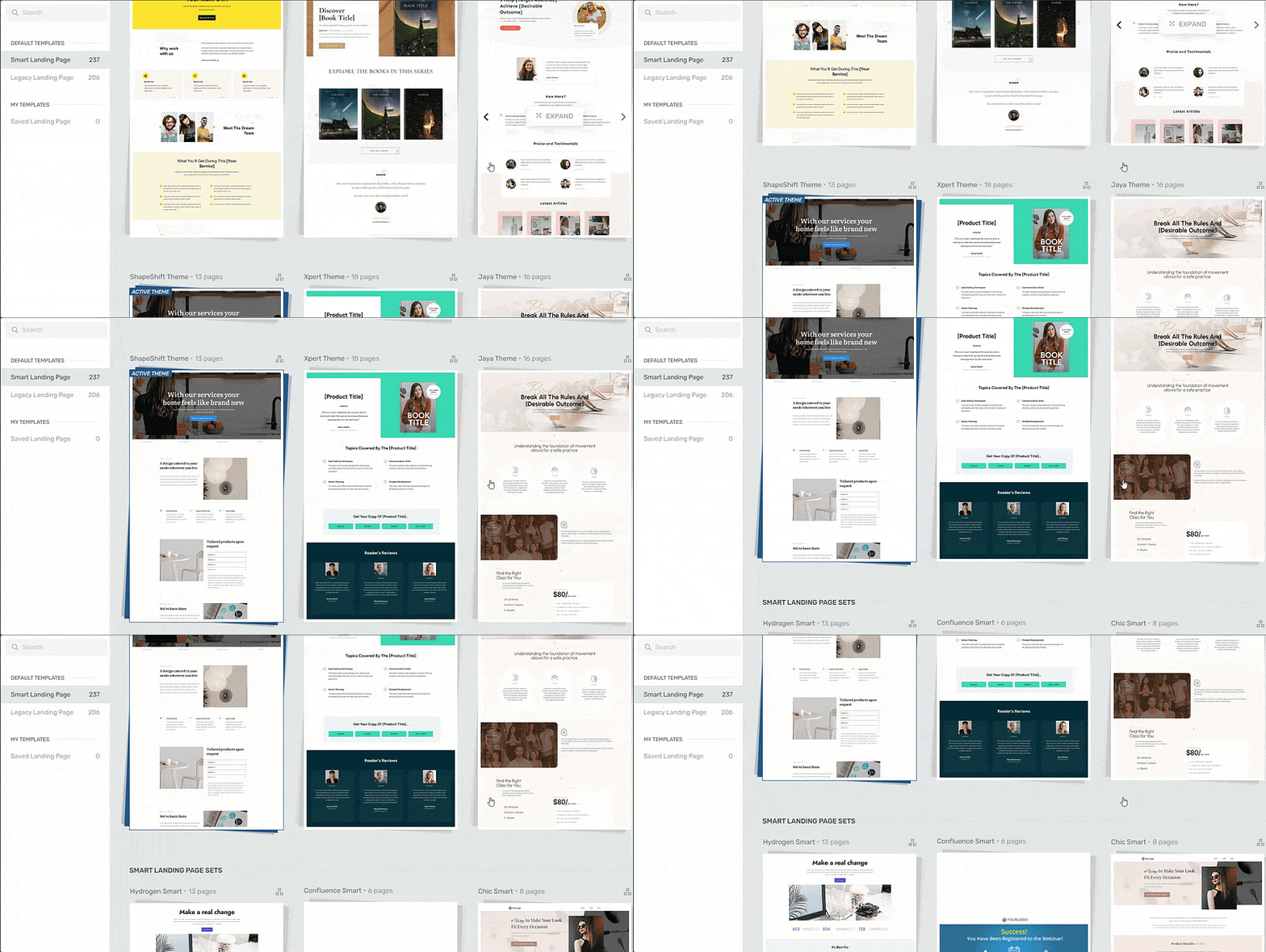
Landing page template sets in Thrive Architect
These templates are more than just visually appealing; they're optimized based on proven conversion principles, meaning they're crafted to get your audience to act.
Thrive Architect is different because every template in our library follows key conversion optimization principles. All you need to do is choose your design, customize the color, add your copy and get started.
This lets you focus on delivering valuable content instead of fretting over design details.
2. Create a New Page in WordPress and Launch Thrive Architect
In the WordPress Dashboard, select the "+ New" button at the top of the page and select "Page".
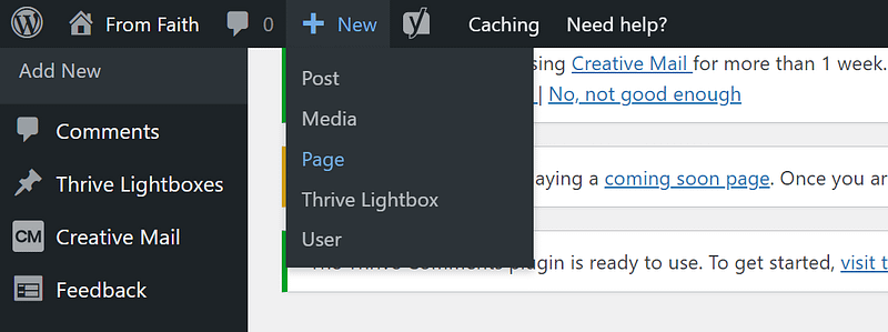
When taken to the next screen, name your page and select the bright green "Launch Thrive Architect" button.

After you launch Thrive Architect, a menu will pop up with four options:
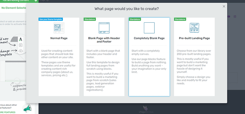
1. Normal Page
2. Blank Page with Header and Footer
3. Completely Blank Page
4. Pre-built Landing Pages
Usually, we’d recommend selecting the “Pre-built Landing Pages” tab, but since we’ll be designing an unconventional page that won’t have the typical site navigation, we’re going to use the “Completely Blank Page” option.
The Thrive Architect editor will open with a blank space, ready for you to work your magic.
3. Customize Your Homepage with Thrive Architect
By the end of this section, you’ll have an upside-down homepage that looks like this:
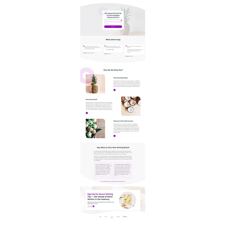
The best part? This took less than 30 minutes to create. And that’s because of one of Thrive Architect’s superpowers – pre-built block templates.
“Building from scratch” doesn’t have to involve using complex code, or adding one singular design element after the other on your page.
We’ve gone 10 steps ahead and compiled block templates that include the main elements each part of your website will need – from pre-designed hero sections, to features & benefits templates, testimonial blocks, and many CTA sections.
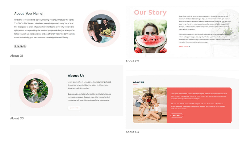
Examples of Thrive Architect Block Templates
Think of these templates as your shortcut to a stunning website. No more staring at a blank page, wondering where to start.
All you need to do is click the blue plus section on the page and access the Thrive Architect block library.

When we say “drag and drop” we mean it.
Now, into the design.
Main CTA Section Above the Fold
The point of an upside-down homepage design (or landing page) is to get your offer right in front of your website visitors’ faces.
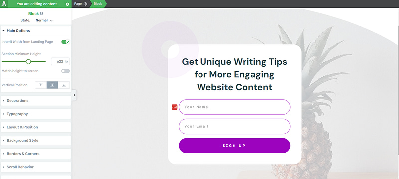
Usually, entrepreneurs or creators want to ease their audience into the offer, before pushing for an action – but that’s what makes this page different.
Your main call-to-action will depend on whether you want to generate leads or sell a product. We don’t recommend using this method for expensive, high-ticket offers because those types of sales pages require more text to connect with the reader before encouraging them to make a steep purchase.
Pages like this work better for offering lead magnets to build your email list.
Our landing page in this example is for signing up to a writing newsletter/community. And we’ve gone into Thrive Architect and selected a lead-generation block template with an opt-in form that suits what we’re looking for best.
Social Proof to Build Trust
Next, social proof.
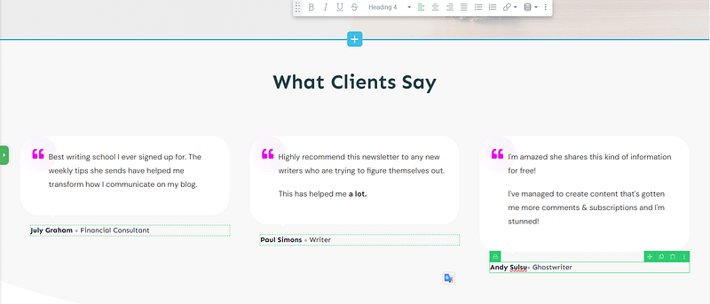
A band of logos from the companies you’ve worked with can fit here. But if you’re new to the business and don’t have reputable logos to share, you can opt for adding testimonials instead.
The point of this placement is to show your audience, after asking them to take an action, that you can trust them. And what better way to do that than with a few glowing reviews from previous customers or current subscribers?
Tip: If you’re struggling to find the courage to ask for testimonials, read this guide to learn 5 effortless ways to add testimonials to your WordPress website and sales pages.
Features and Benefits Section to Drive Interest
Use this section to paint a picture of how your offer can make your potential customer’s life better.
If they’ve kept scrolling to this point, they’re interested in learning more about your offer.
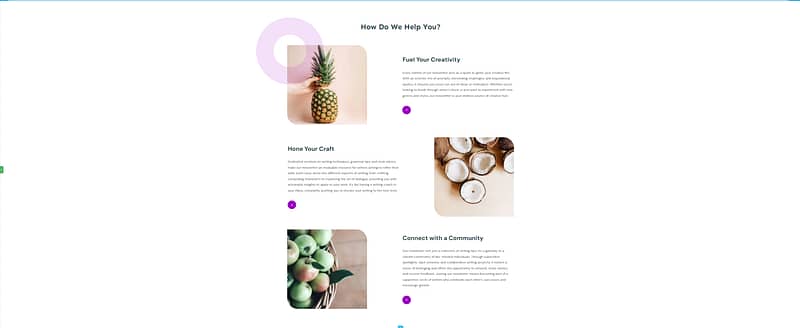
In your landing page copy, don’t just tell them what your product entails, describe how each feature will help improve your reader’s situation.
Main Description Section to Sell Your Offer
This part of the page drives home the value of your offer. Use this area to connect with your writer’s pain points and use words to create a visual of what life with your solution looks like.
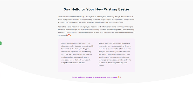
Why does this matter? Because stories stick. They're memorable. When a potential lead or customer sees themselves in the pilot story, their curiosity turns into focused interest.
Keep your writing concise, you don’t want it as long as a book or TV show script.
Tip: If writing isn’t your forte, you should dive into these copywriting tips to create the best content for your pages.
One More CTA Section

End your page off with one more CTA section, in case they weren’t ready to opt in at the top of your page.
You can add another form here, or a button that redirects your visitor to the original form at the top of the page – you’ll need to configure a jumplink to make that happen.
Navigation Menu

Finally, it’s time to add your navigation bar to the bottom of the page. You can easily create this with the custom menu element in the right-hand sidebar.
Drag and drop the element on your chosen display location on the page. You don’t need to add a menu name.
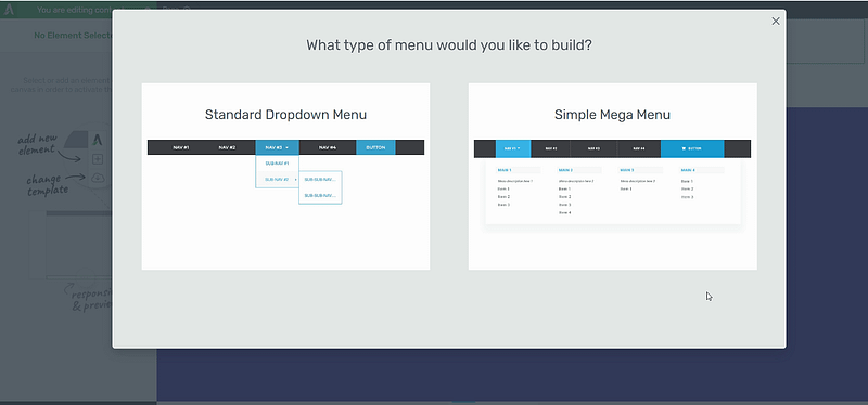
Once you’ve placed the “Custom Menu” element a screen will pop up with two options – “Standard Dropdown Menu” and “Simple Mega Menu”.
Select “Standard Dropdown Menu” to keep your site’s navigation streamlined and straightforward.
Next, you’ll need to choose between “Custom Menu” and “Existing WordPress Menu”.
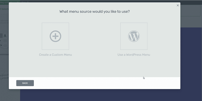
The “Existing WordPress Menu” option lets you add a menu from the WordPress dashboard to your new page. You’ll need to create a navigation menu, first, to use this option.
The “Custom Menu” option lets you create a menu in Thrive Architect.
After clicking “Custom Menu”, you’ll be directed to a library of dropdown menu templates.
Find a template you like and click it.
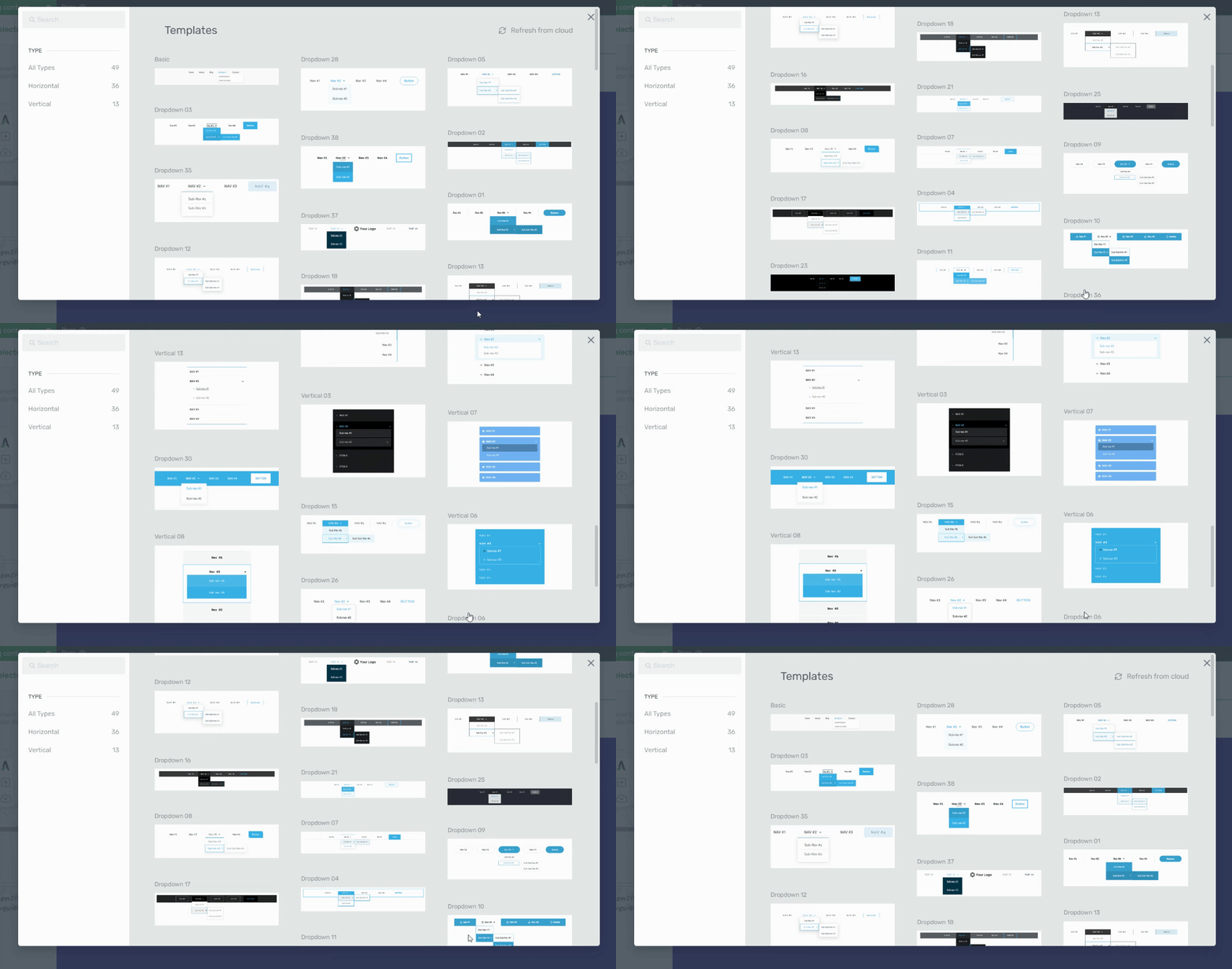
Once your menu template has loaded on your page, it’s time to customize its appearance and configure your main menu settings. All of this can be done from the left sidebar in Thrive Architect.
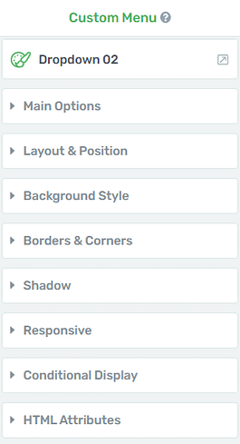
In this sidebar you can:
Choose your dropdown menu’s structure (vertical, horizontal, or hamburger)
Select the main accent (color) for your menu’s text
Set spacing between each menu heading
Choose a dropdown icon
Set a dropdown animation
Create menu items or customize the existing ones
Remove sub-items and parent items
Add custom navigation links to your menu items and sub-menu items
You can also click on the menu items, directly, to edit their names.
There are additional settings in the left sidebar that allow you to edit your menu’s margins, paddings, borders & corners, and more.
Once you’re happy with your menu’s appearance, click “save menu” and view a live preview of your page from different screens to make sure it looks good and works well.
Next Steps: A/B Test Your New Landing Page
The best way to know find the best landing page layout for your offer is through running regular A/B tests.
You can get this set up easily when building your pages with Thrive Architect.
When you purchase Thrive Architect, you get immediate access to Thrive Optimize, an easy A/B testing plugin that will help boost your page conversion rates and lower bounce rates.
We also recommend connecting your site to a Google Analytics plugin, like MonsterInsights, so you can keep track of how visitors interact with your website design.
Start Driving Website Traffic to Your New Homepage
Now that you’ve got an impressive upside-down homepage, it’s time to get it in front of the right eyes.
Here are 4 free website & marketing tutorials to help you grow your audience & get your business noticed:
8 Content Marketing Strategy Hacks to Grow Your Online Business
7 Keyword Research Tips for the Busy Entrepreneur (Improve Search Page Rankings)
How to Create SEO-Friendly Blog Posts Users and Bots Will Love (14 Tips)
As you’ve seen, building landing pages for your WordPress site isn’t hard when you’re using the right tools.
Thrive Architect is your go-to for crafting a hassle-free pages that are designed to convert visitors into quality leads and customers – helping you grow your business.
This tool simplifies the technical side of things, freeing you up to concentrate on what you do best: connecting with your audience and delivering standout content that drives your business forward.
So if you’re ready to level up and create funnels that boost your conversion rates — and snag more potential customers — you know what to do.

