“Aaargh!” Ctrl + Z.
I had revised my first sales page over 80 times and still hated it!
So many unanswered questions swirled in my head because I had no idea what even made a sales page that converts.
All this stress, uncertainty and time lost… just to sell a mere $50 course?!
Now many years later and wiser, I’ve put together the ultimate research article of sales pages for low-priced online courses, so you don’t have to go through the frustrations I did.
This article even comes with a brand new sales page blueprint designed for selling low-to-mid priced online courses for between $19 and $250. Read on!
More...
Why Low-To-Mid Range Prices?
We recently published an epic post that pulled apart how the best online marketers create Sales Pages for Online Courses, and we went live on YouTube to discuss it even further.
Most of the examples we explored were for courses priced between $500 and $4,000. But one question kept popping up in the comments:


It’s a good point. Small, just-getting-started businesses rarely create a product at that high price point to begin with, so this time we’re doing the study again with courses at lower prices.
We’re going to study 6 different pages, all for digital products between $19 and $249. Here they are in ascending price order:
> 90 Day Bikini Plan, by Rudy Mawer: $19
> Advertising Workshop, by Traffic and Funnels: $27
> Black Magic Pocket 4k Video Guide, by DSLR Video Shooter: $79
> Refactoring UI book, by Refactoring UI: $79 - $149
> Two courses by Hearts in True Harmony: $29 and $198
> Smart From Scratch by Pat Flynn: $249
Note: Some of the examples studied here have been updated since the first time we looked at them (in 2019). We've kept the older examples here because they're still similar to the present ones, and hold the same takeaways you can use on your own funnels.
And if you stick around to the end of this post, you'll get our recommended Sales Page blueprint! For the TL;DR, just follow that blueprint as you build out your own low-priced course sales page.
"But How Do I Build a Sales Page?"
We have a landing page building tool called Thrive Architect that is perfect for building high-converting sales pages on WordPress and comes with templates you can load in a few clicks. You can use the drag-and-drop editor to create your sale pages and link your purchase button to any checkout system, even if it's hosted off-site. Check out this guide on how to build your first sales page!
Pat Flynn - Smart From Scratch

Pat Flynn is internet-famous for his podcast, Smart Passive Income and his course Smart From Scratch is the highest priced product that we’re looking at in this post.
At $249, it ought to be a substantial offering. However, Pat has an advantage: traffic.
His podcast has over 600 episodes at the time of this article's writing, and from it he’s grown a massive audience. Even if there are better products at lower price points on the market, people don’t buy what they haven’t heard of.
Nonetheless, his sales page is reasonably short. Have a look:
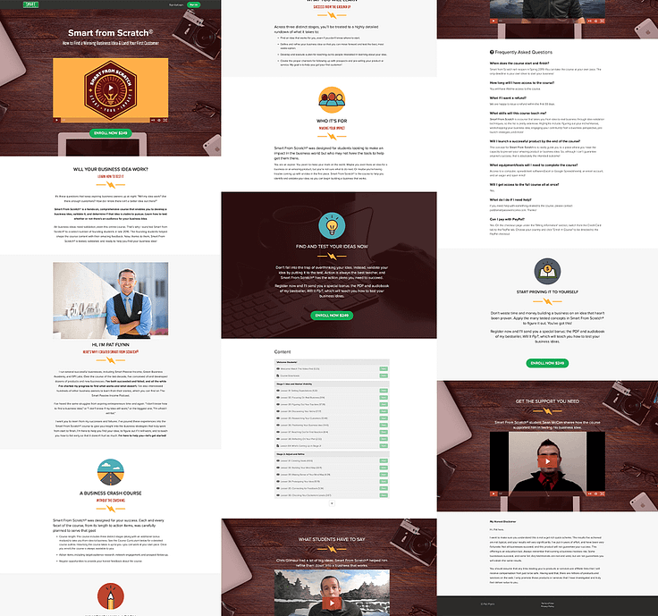
Smart From Scratch sales page, only 1500 words.
What Makes This Sales Page Work:
The Smart From Scratch sales page is very simple and clean. This is an example of how to not overcomplicate things.
That said, it’s very well structured. The ordering of the sections just makes sense. Let’s zoom in.
Above The Fold
Pat’s sales page shares an identical above-the-fold to the higher priced premium pages we looked at… except for one key difference:
There’s no countdown timer.
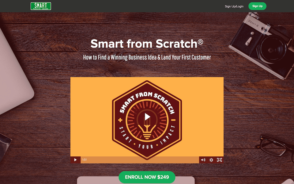
Identical above-the-fold to courses 10x the price, minus the countdown.
Pssst… if you’re unfamiliar, ‘above the fold’ is a word from when Newspapers used to be folded in half on newsstands. A website’s above the fold is everything visible on load without scrolling.
What we do see on Pat's sales page is that that familiar structure:
Smart From Scratch is both the highest price course that we are looking at in this post (we set the limit at $250 and this one just scrapes in), and it’s also the only one with an open-closed enrollment system.
Open-close enrollment means you can join the course for a set period of time, and outside of that time, it is unavailable.
Every other sales page in this this article is open all year round.
Usually, open-close enrollment means a countdown timer is placed visibly on the page, and yet there was none to be seen on the Smart From Scratch sales page.
This sales page has since closed and the ‘Enroll Now’ button has been replaced by a ‘Get Notified’ opt-in form.
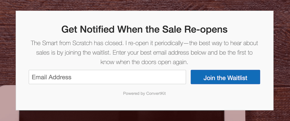
Rather than closing the entire page, just the 'enroll now' button is replaced with an opt-in form.
Author Introduction
Pat Flynn’s website, podcast and product rely heavily on what’s called Personal Branding. In other words, his face and name is front and center on… well… everything.
Since that is such a selling point, the sales page doesn’t introduce him towards the end like most do, but rather introduces him near the start:
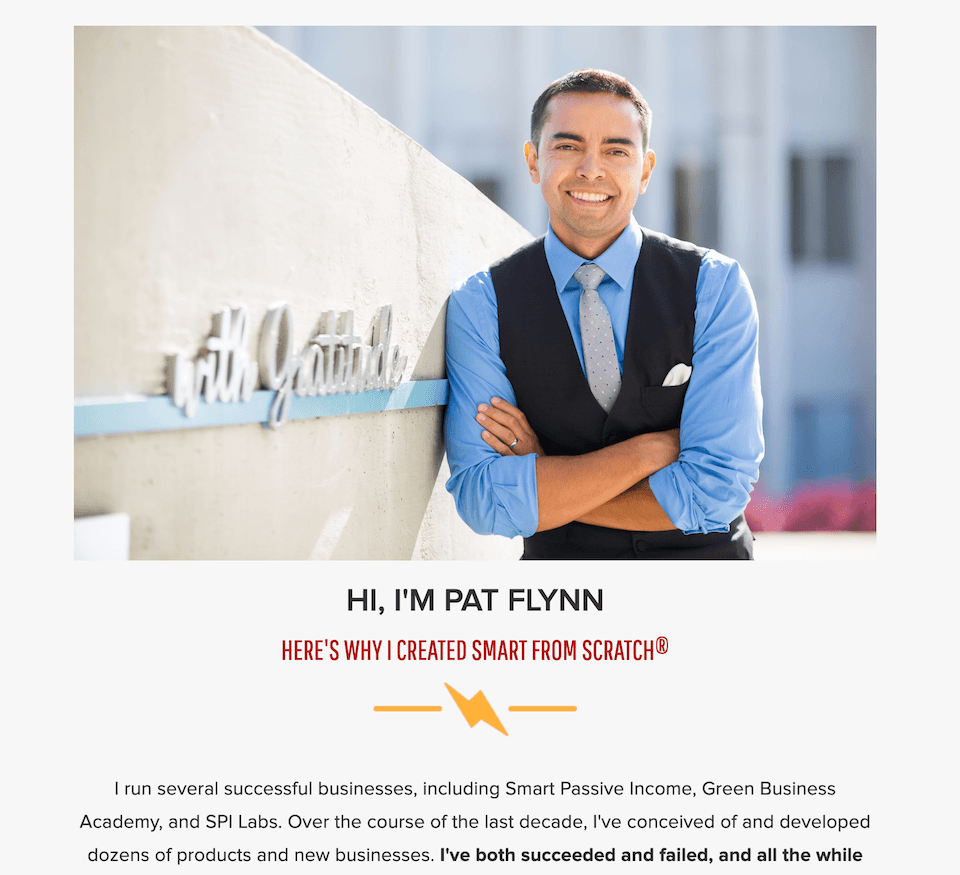
Pat's simple and clear author introduction.
Whether an Author Introduction is used early on a page in Personal Branding examples, or later on a page where the author is less known, what’s important is that it communicates validity.
Pat’s author intro validates his authority on this topic by showing his experience. That is what’s key with author descriptions: show them why you are the one to teach that topic.
(P.S.: if you are growing yourself as a known authority in your business, check out our Homepage template for Personal Branding)
Content Section:
The high priced courses we examined often used Module Boxes to show off the content inside the course. Smart From Scratch achieves the same result with a different and simple method: a list of lessons.
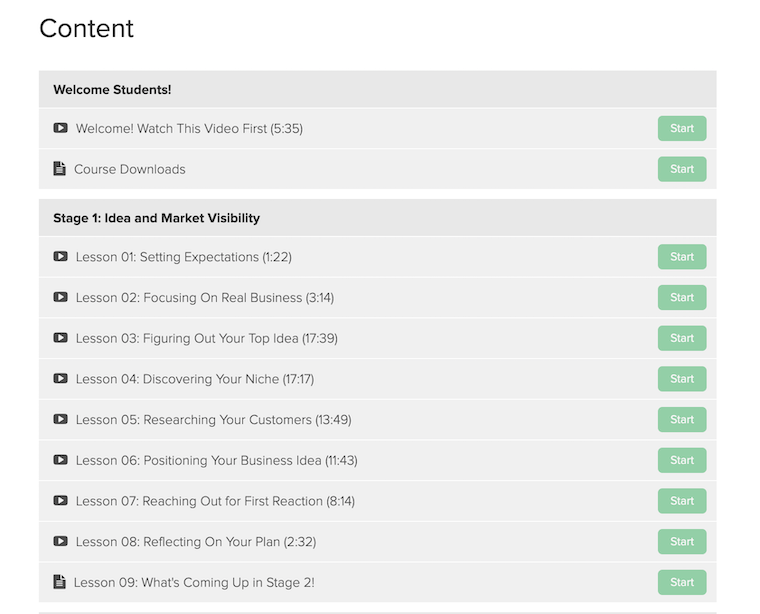
That's an enticing list of lesson titles!
The titles of those lessons are appealing too, and this was something we saw premium and low-priced courses do well.
Rather than just calling it ‘Lesson 03’ and leaving it at that, the benefit of the lesson is captured in the extended title, “Lesson 03: Figuring Out Your Top Idea (17:39)”
Including the lesson length in minutes and seconds after each lesson title is a charming touch. To the wary visitor unsure if the course is right for them, it’s promising to see that the bulk of the course is completed just by watching short videos.
Video Testimonials:
You might remember that when we looked at Ramit Sethi’s Zero to Launch sales page, we noted how it had 55 testimonials. Crazy right?
Well Pat’s sales page has only 2… but both of them are Video testimonials.
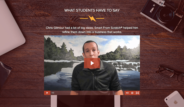
Only two testimonials, both which are video testimonials.
And don’t be fooled by the seemingly pretty layout. Both testimonials are just a single video piece to camera with no clever editing or effects.
Nailing The Structure:
When you look carefully at this sales page, you can see that it’s a perfect answer to a structural question: What do you write about in what order?
The page includes 3 sections with headings that just make sense. Here they are side-by-side for you:
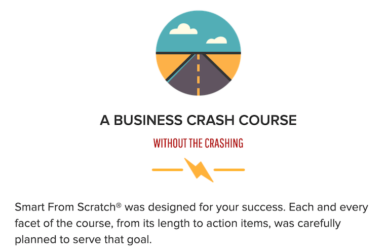
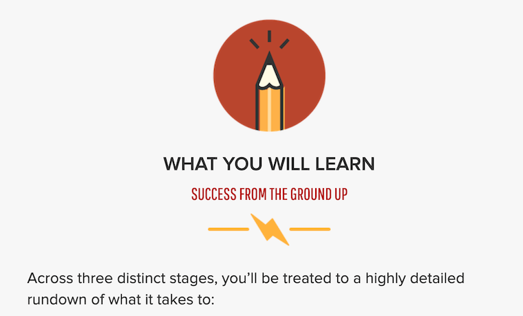

3 background sections answering vital course related questions.
That order just makes sense. It succinctly answers the 3 most important questions anyone needs to know:
- What is it?
- What will you learn?
- Who is it for?
No matter how long, short or simple your sales page is, make sure you answer these 3 questions.
If you’re starting out, don’t make this more complicated than it needs to be. Just answer the 3 points in order, each with a subheading to break them up.
Key Takeaways from Start From Scratch
> Structure Matters More Than Length: Make sure the sections in your page follow a logical order that matches what visitors are thinking of next.
> Validate The Authors: Whether you introduce the teachers early or late, you’ve still got to show why they are worth learning from.
> Attractive Lesson Names: When you show what the lessons or modules are in your course, avoid uninspiring names. Use benefit driven lesson names instead.
Hearts In True Harmony courses

How much does the price of a course affect the sales page needed to sell it?
This is a question that has come up a few times, including in the comments on our YouTube live:

And it’s a good question: Does a higher priced product need a longer page?
Well, let’s compare 2 different course sales pages by one company; one for a $198 product and another for a $19 product.
Hearts in Harmony are a husband and wife team trained in Counseling Psychology who were once proudly featured on Oprah. They have a variety of courses targeted to niche counseling concerns.
- 1Lasting Love Made Easy is a $198 course with 7 hour-long video lessons that promise to teach you lasting relationship skills.
- 2Learning to Love Yourself is priced at $19.97 and doesn't include any video lessons. Instead, it’s a best selling book, audiobook and 160 page workbook combo that teach customers to do exactly what the title says: to love themselves.
This is an example of how video lessons have a greater perceived value than text or audio only lessons. You can read more about how to instantly increase the perceived value of your online course here.
So, comparing $198 to less than $20… how different are the sales pages? Let’s have a look:
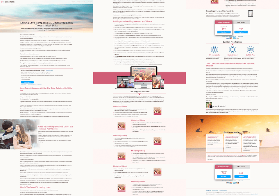
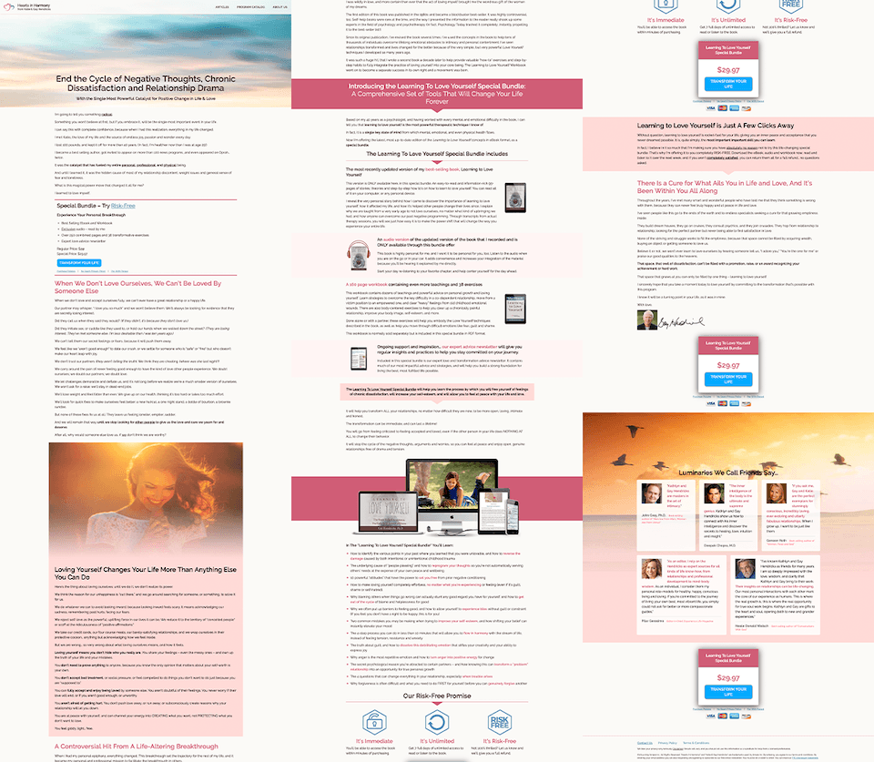
$198 (left) and $19 (right). They look very similar, don’t they?
What Makes Their Sales Pages Work:
A first glance at these sales pages gives you an idea of the structure, and they are nearly identical despite their differing prices.
But what you’re likely to miss at first glance is the copywriting.
There’s a knack to sales copy that often takes practice, and whoever wrote these pages has got that knack. Sentences are short and punchy, they accurately sympathize with the pain that the courses solve, and the pages make bold promises of what it feels like to be free of that pain.
Here’s some examples.
Benefit Driven Headlines
I said it in the previous sales page post and I’ll say it again: Your sales page headline has one job… To keep the visitor reading.
That’s it. Of course, you want to keep the right visitor reading; the visitors that may actually be interested in buying your course. So what's best way to do that? Outline a strong benefit right at the top:


One product is 6x the price, but headlines still do the same thing.
Neither of these headlines mention an actual course, either. Remember: people don’t want to buy courses, they want to get results. So these headlines promise those results first.
This is the same tactic used on sales pages 10x the length selling products for nearly $4000, and yet here it is for a $19 product too.
Box Shot Course Graphic:
Once visitors understand that there is a product, the natural next question is: ‘What exactly is it?’. But within that question, visitors are trying to understand how they will consume the product.
A picture is worth a thousand words, right? That’s the value of a box shot:
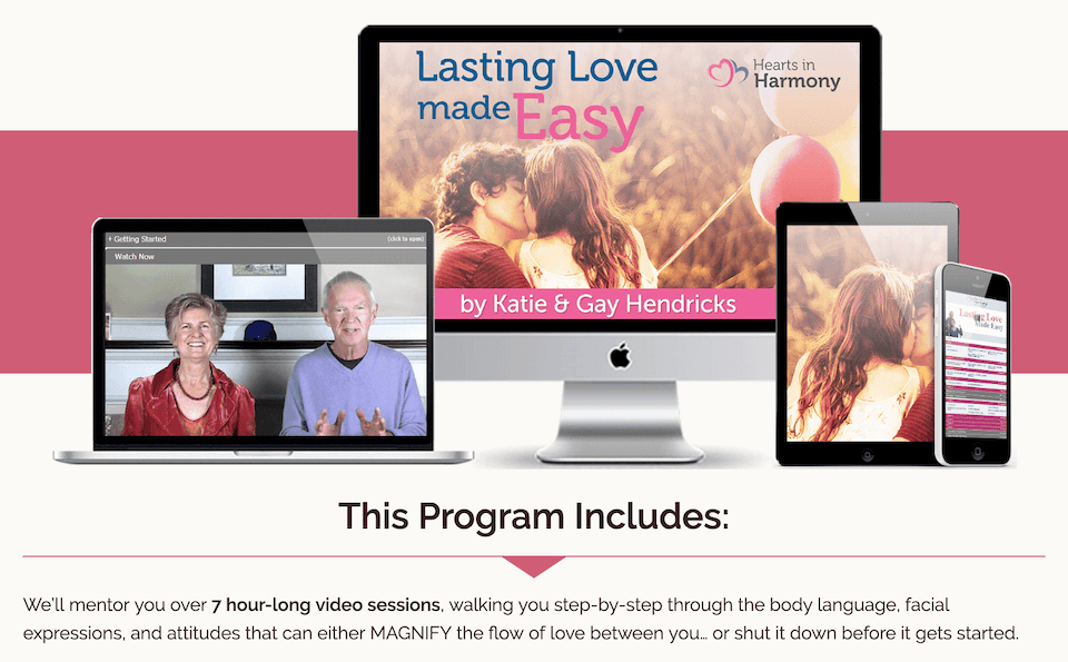
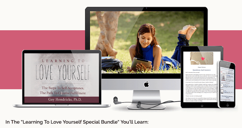
Near identical box shots too. Video course (left) vs text/ audio course (right)
With just one graphic, it’s clear that this is a digital product accessible on mobile and desktop. Look a little closer and you’ll see the audio/ text course on the right ($19.97) doesn’t include any graphics of a video, but it does include earbud headphones at the bottom of the box shot.
How Do You Drive Your Call To Action?
If you’re asking someone to fork out $200 versus a measly $20, the call to action/ pricing table should be different, right?
Nope. Have a look.
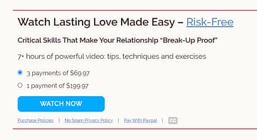
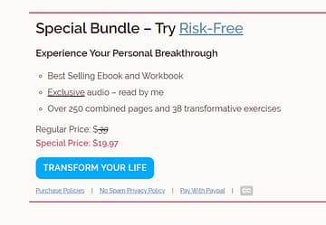
Near identical pricing tables for both products.
Once again, these pricing tables are nearly identical. Note how simple they both are. If this was for a $2000 product, then it might be a different story, but for courses below $250, this is more than enough.
A Personal Sign-Off
This was an often-included feature on very high priced sales pages and here it is for two low priced products too: a personal and emotional note from the course creator.
I’ll just show you one of them, since both of these courses had the same section tailored to their products.
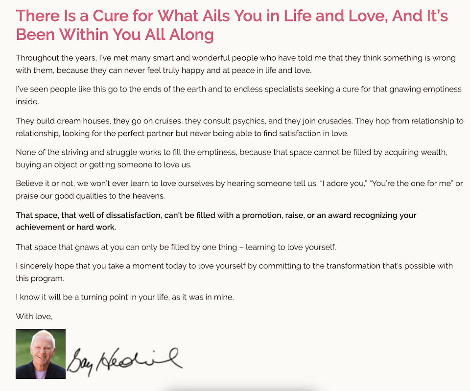
A heart-warming sign off at the end of the sales page.
This section comes right after the pricing table and includes a headshot and signature from the course creator. And it’s emotional. Remember, how people feel about your product has a great influence on their decision to purchase. Here are two sentences pulled from this section to show you what I mean:
“I sincerely hope that you take a moment today to love yourself by committing to the transformation that’s possible with this program. I know it will be a turning point in your life, as it was in mine”
Key Takeaways from Hearts in Harmony
> Structure is the Same: Whether you are selling a $20 course, $200, or even a $2000 course, the general page structure will mostly be the same.
> The Easy Headline: Not sure what your headline should be? Easy! Just write the ultimate benefit your course provides and reword it until it feels right.
Blackmagic Pocket 4k Video Guide - DSLR Video Shooter

Have you ever bought a technical product, something like a DSLR camera, that came with a chunky instructional manual? Reading the manual is not exactly easy, is it? Especially if you’re a visual person...
DSLR Video Shooter is a website that creates video tutorial courses on how to get the most out of your camera. Each course is made for a specific camera and purpose. Take for example their Blackmagic Pocket 4K Video Guide, which they are selling for $79.95
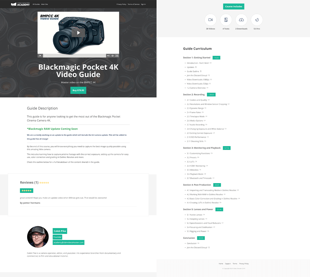
The shortest sales page in review
Why It Works:
The newly released Black Magic Pocket Cinema Camera has filmmakers drooling. It’s compact, powerful, and produces stunning 4K video like few other cameras on the market, all at a $1295 price point (that’s cheap, if you weren’t sure).
So for someone that has just paid that kind of cash for the camera, paying an extra $79.95 for a professional video course to show you how to get the most of out of it could be an easy sell.
In fact, specificity has marketing power. If you own that specific camera, this course is far more appealing than a generic course on cameras.
For that reason, the page is super short because it doesn’t have to try very hard. Product context makes all the difference and the benefits are clear: Buy the course and you’ll quickly become a pro with the Black Magic Pocket Cinema Camera.
Above The Fold:
Video, Headline, Tagline, CTA. Seeing a pattern? It’s the same above the fold as other low priced pages and the high priced ones too.
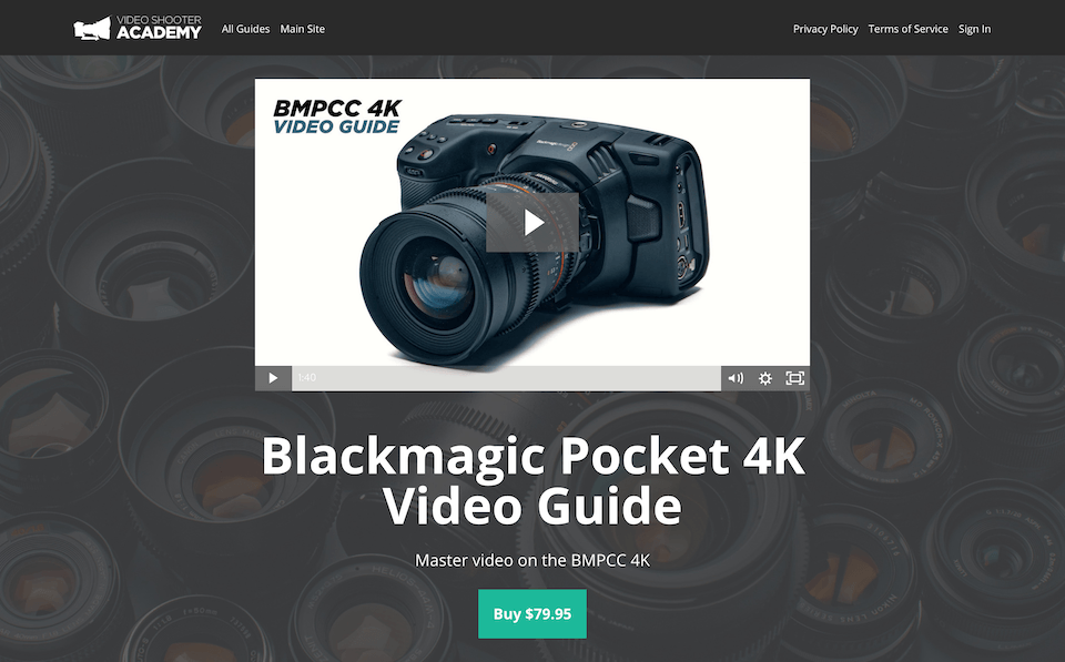
Yes, a $79 product has the same above-the-fold as a $4000 product.
So yes, even for a product less than $100, they are choosing to sell it with a video. That doesn’t mean that you have to, but it does depend on product. People buying video cameras tend to think in video, so it makes sense to include a product video on the page.
Super Simple ‘What You Get’
Although some high priced sales pages are really detailed when describing what is actually in the course, this one is not. A simple background section with a few icons communicates the important info and then moves on.
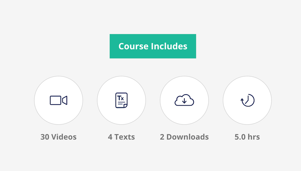
Simple graphics to show what you get.
The only problem with this approach is that it relies on volume as an expression of value. 30 videos for a total of 5 hours may seem valuable, but if a course creator is able to communicate the same teaching in less, wouldn’t that be better?
Don’t fall into the trap of thinking that volume justifies price.
Course Content
Another familiar section, just like Pat Flynn’s: A breakdown of individual lessons.
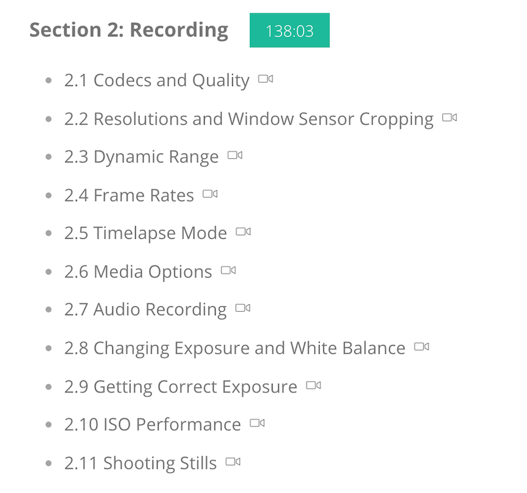
List of lessons shows what you'll learn.
Each one has a name that explains the lesson content, a camera icon to show that it is a video lesson, and a total time of the section at the top. This appears to be a popular way to show what students will learn.
A Note On Off-Page Marketing:
What’s missing when viewing this sales page is any acknowledgement of the course creator’s marketing efforts off page.
Caleb, the course creator, has a sizable YouTube audience. His publicly available videos are proof of his knowledge and expertise, so most sales page visitors are already familiar with him. For that reason, this sales page doesn’t need to win the audience over as most of that is done elsewhere.
If you’re trying to convert cold traffic, a longer sales page would make more sense.
Key Takeaways from Blackmagic Pocket 4K Video Guide
> Make the Sales Page Your Audience Needs: Rather than thinking “what’s the right length for my sales page?”, think how much content is necessary for your specific audience to buy that specific product.
> It’s Ok To Keep It Simple: Starting small is perfectly acceptable. No need to feel overwhelmed by mammoth sales pages. Do what you can now and expand when necessary.
Traffic And Funnels - Advertising Workshop

Have you heard marketers rave about how it’s all in the copywriting? It’s true. A high-converting website isn’t necessarily one that looks beautifully designed — and the same can be said for sales pages.
If you want to see good copywriting (although admittedly quite ‘salesy’), then check out the Advertising Workshop sales page by Traffic and Funnels.
This is for a $49 online course.
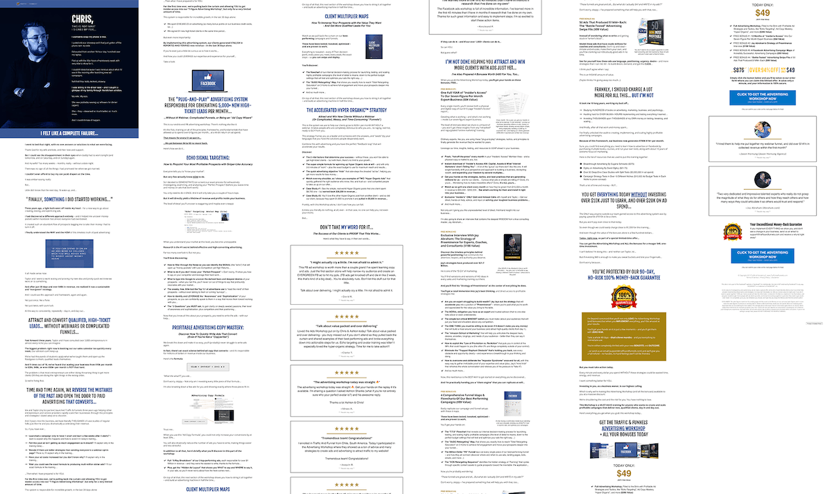
Predominantly text-based sales page.
Why It Works:
This is a mid-length sales page, coming in at 4500 words, and it’s almost entirely text except for a few design choices to break it up. But damn it’s easy to read!
Simple color palette and an easy to follow structure.
Let’s get in close.
Story Start:
Finally, a different above the fold design! There’s no video in this one. No call to action either, and it doesn’t even have a headline! To bypass the need for an author bio anywhere on the page, it starts with a photograph of the course creator and his name: ‘Chris’.
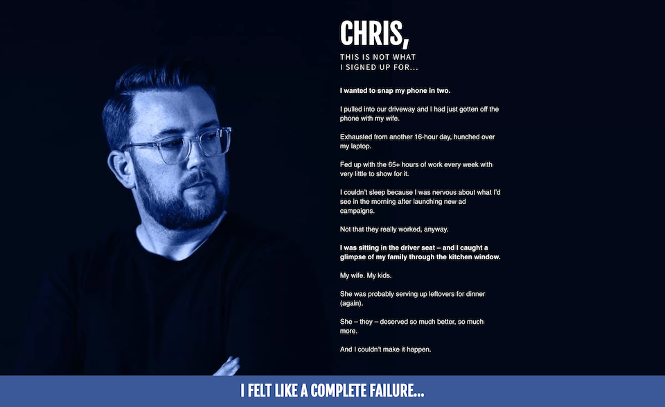
This sales page dives straight into a story first.
I’ve written about the PAS format for copywriting before. It stands for Pain Agitation Solution. The theory is that you need to really hit at your visitors pain points. The more accurately you hit that pain point, the more inclined they are to read on for the solution.
I’ll copy-paste the first few paragraphs so you can see how this is being used above-the-fold on this sales page:

“THIS IS NOT WHAT I SIGNED UP FOR… I wanted to snap my phone in two.
I pulled into our driveway and I had just gotten off the phone with my wife.
Exhausted from another 16-hour day, hunched over my laptop.
Fed up with the 65+ hours of work every week with very little to show for it.
I couldn’t sleep because I was nervous about what I’d see in the morning after launching new ad campaigns.
Not that they really worked, anyway.
I was sitting in the driver seat – and I caught a glimpse of my family through the kitchen window.
My wife. My kids.
She was probably serving up leftovers for dinner (again).
She – they – deserved so much better, so much more.
And I couldn’t make it happen.”
- Above the fold, Advertising Workshop sales page
Talk about hitting the pain points! With absolutely no mention of the product, they’ve gone straight to the pain of not feeling like you can provide for your family, a primal pain that many startups or entrepreneurs early in their career may feel.
It’s great writing. And it works.
Simple Testimonials:
Once again, no need to get fancy — look at the testimonials here.
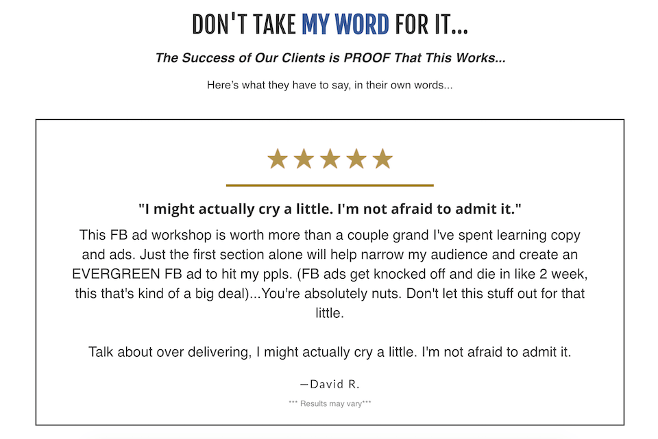
Easy-to-read is more important than beautifully designed.
It’s a box, some stars, and some text. What makes testimonials like this work is the content inside of them. Getting those testimonials might be a bit of a challenge, so check out our guide on how to get raving testimonials for your online course.
Proprietary Methods:
There are psychological reasons why we need our curiosity satisfied, and great marketers can leverage this to their advantage. Used poorly, it feels like clickbait. But used correctly it can drive conversions and grow a base of satisfied customers.
Here's an example: imagine you are considering one of two courses. One says “Learn how to drive traffic to your website”, the other says “Learn the Godzilla Traffic System to drive traffic to your website”.
Aren’t you immediately curious about the Godzilla Traffic System? Of course you are. And yet it’s a completely made up example.
The use of a named proprietary method highlights what you don’t know. Everyone knows at least a little bit about driving traffic. But if you don’t know what the Godzilla method is, then you are more aware of your lack of knowledge. You are curious.
Look at how Traffic and Funnels are using this trick on their sales page:
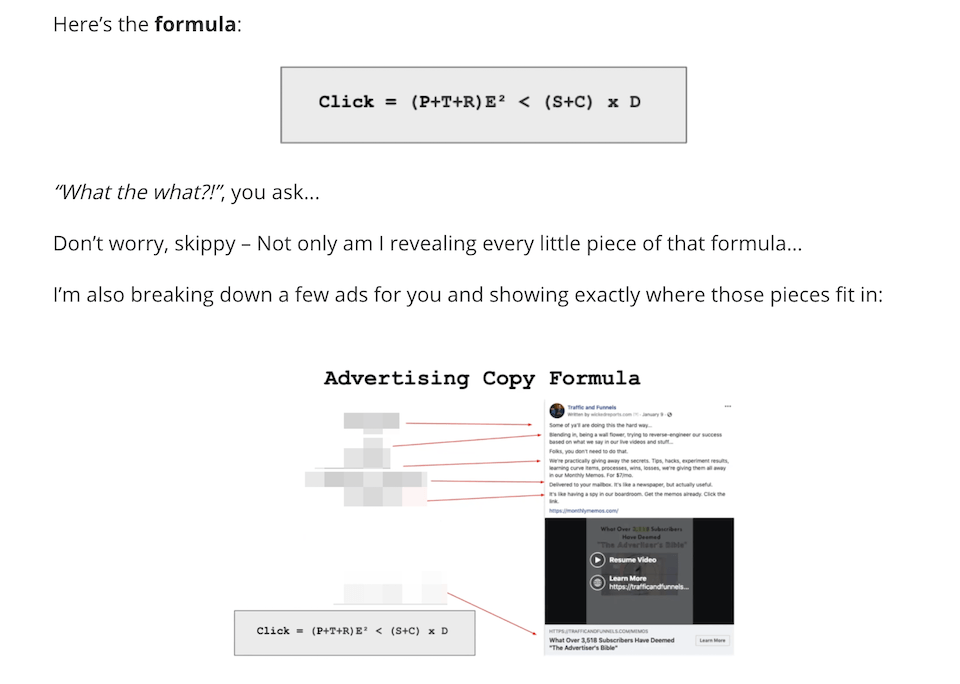
A tasty lookin' formula creates lots of curiosity
There’s a formula, it has numbers and letters, so… it must mean something! But as a reader, you don’t know it yet.
How do you find out? By buying the course.
It’s a bit of a sneaky trick, but it can work. Just make sure you actually deliver on value or else it feels like clickbait.
Price Anchoring:
This technique was used with $2000+ sales pages too, yet here it is for a $49 product: Price Anchoring.
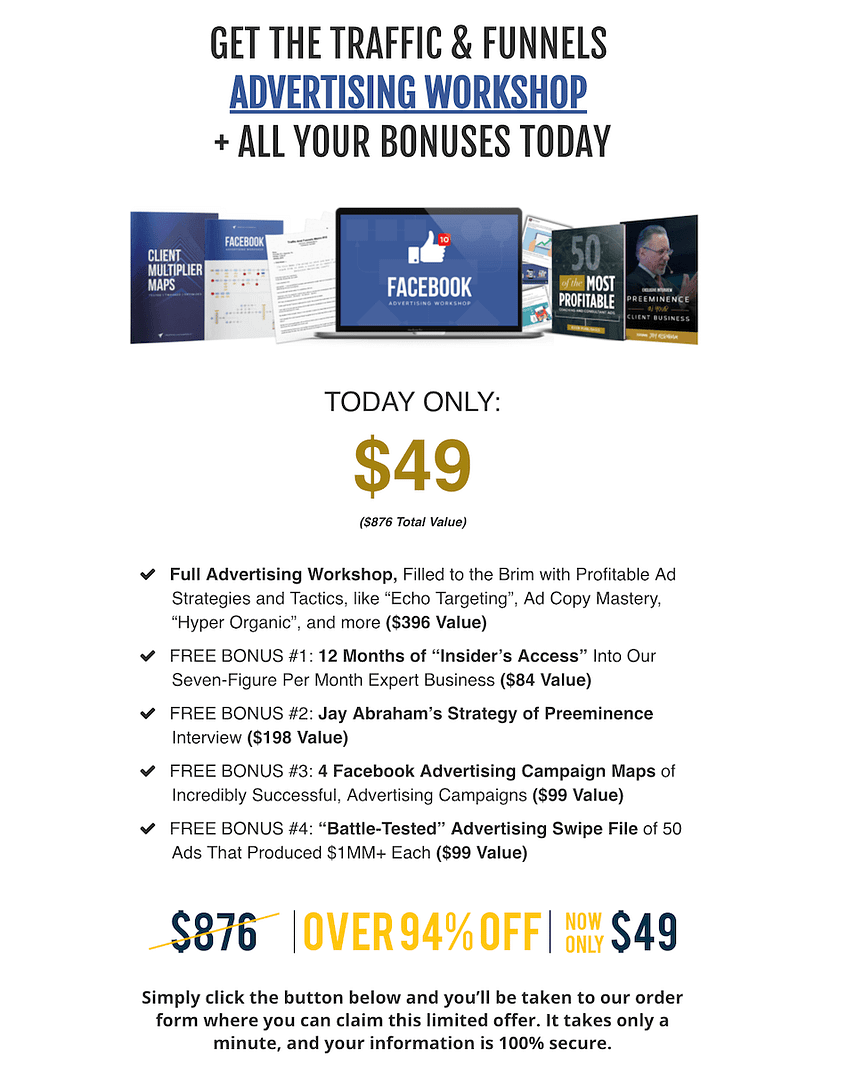
Note the list of bonuses, each with an allocated value.
This list breaks down the monetary value of each element in the course, then adds it all up to $876. Then, immediately they chop it all away to offer it for just $49.
Why?
Because it works.
Do they ever sell the course for $876? Unlikely. So why even bother? Because it changes the visitor’s perception of value.
I’m not here to tell you that you should or should not do this… only that businesses are doing this and it appears to be working. The choice is up to you.
Key Takeaways from Traffic and Funnels
> Focus On Copy: You don’t need a video or excellent design to sell your course, but you do need good copy. It makes a difference, so check out this article on how.
> Name Your Methods: Want to hook your readers? Come up with unique names for your methods and make sure you deliver on your promises.
90 Day Bikini Plan - Rudy Mawer

Rudy Mawer is a celebrity fitness trainer for Hollywood movie stars, professional athletes, models and bodybuilders.
Although the fitness industry is rife with hyper-masculinity, Rudy’s area of expertise takes a different angle: he’s a leading sports scientist and expert when it comes to female specific fat loss, transformations and hormones.
As a coach, it’s likely he’d charge a high-price for personal fitness coaching. But by offering an online course he can set the price very low and offer his knowledge to the average non-celeb.
The 90-Day Bikini Plan is an online program selling for only $19 (though the sales page strikes that price down from $199), and design and color choices make the target demographic very clear:
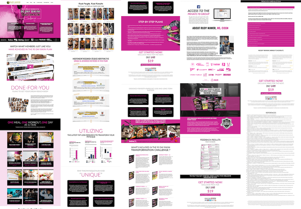
Bright, colorful sales page design.
Why It Works:
The first thing we need to acknowledge is that the fitness niche is competitive. There are thousands upon thousands of coaching programs, courses, regimes and fitness plans that you can find online.
This is significant because the average fitness enthusiast looking for a transformation won’t buy everything out there: they’ll just buy what feels right for them. So marketers in this niche need to be very specific with who their product is for. This sales page nails it.
Real People, Real Results
No matter how good a marketer you might be, the number 1 question you must answer is: “But does it work?”
The 90 Day Bikini Plan shows their results front and center, both with a prominent video testimonial near the top and a box of results images:
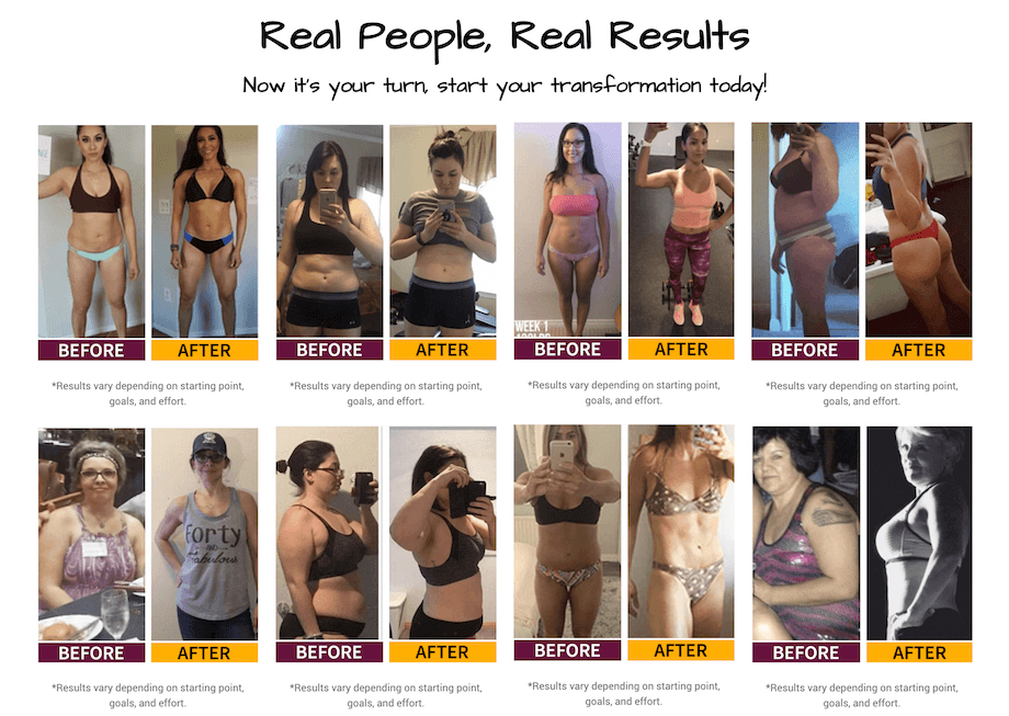
Proof-of-results can be as easy as a series of images.
Anyone skimming the page can quickly see that other people just like them have gotten results from this program.
Backed By Research
Get inside the mind of a potential buyer who is reluctant to believe the dramatic-claims of fitness transformations mentioned on this page. Imagine they are a little bit skeptical. How do you conquer that skepticism?
One way is to cite scientific proof, to show that this isn’t just any program, but rather that it gives you all the benefits of research in one easy-to-follow system.
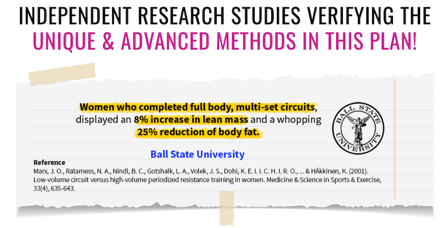
Research quotes to add authenticity to their training program.
Adding something like this to your sales page isn’t difficult either. It’s literally just a single sentence from a university published study quoted alongside references and a logo.
4 short quotes, presented in a very eye-catching way. You could do that too, couldn’t you?
No Modules? No problem!
Many online courses are broken up into Modules and Lessons. This one isn’t. It’s about a time frame of 90 days or 12 weeks. So rather than showcasing what you’ll learn inside each module, they have to find a way to split apart the program into different identifiable elements, each with its own inherent value.
This is a common feature of well-marketed online courses. It works by essentially saying “Get this one big benefit as a result of getting these small things with smaller benefits”. Here’s how it’s communicated on this page:
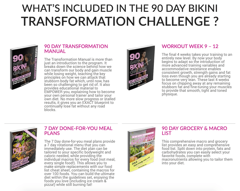
Instead of modules, each key feature is its own package with a graphic.
Perhaps your online course is a program rather than modules. You can still take the concept of Module Boxes and apply them differently.
Key Takeaways from 90 Day Bikini Plan
> Results Matter: Your conversions will improve dramatically when you can prove that your course gets results.
> Add Credibility: Citing external sources is a great way to educate your sales page visitors and add credibility to your course.
Refactoring UI

Here’s a different type of package: a 218-page PDF book, with 3 accompanying tutorial videos for $79.
What’s the topic? UI, or ‘User Interface’ design.
Refactoring UI are a duo team of developer-designers who publish design tips, articles and screencasts all about User Interfaces.
Take it from us, a software company: UI is a valuable area of study. Great UI makes any software, app, or website easy to use and visibly clean. Poor UI makes for a terrible user experience and can visually overload.
Creating a great User Interface is both an art and a science, and for small developer teams, Refactoring UI’s book may be the perfect training to help them design professional products. Here’s their sales page:
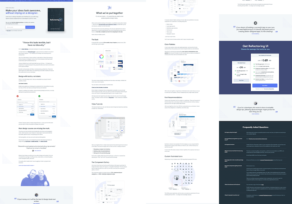
Refactory UI's sales page.
Why It Works:
First thing to note, Refactoring UI do not refer to this as a ‘course’. In fact, the word only appears once on the page when they critique what most design courses fail to do.
Instead, this is an information product with supporting files. The base price is $79, but they also have a $149 pricing tier that includes 4 bonuses: a component gallery, tailored color palettes, font recommendations, and an exclusive icon library.
Although the sales page follows a similar structure to a classic online course sales page, this one has a few standout differences worth seeing.
Opt-In Above The Fold:
Of all the sales pages studied in this post and all the premium sales pages in Part 1, this was the only one that included an Opt-In Form above the fold.
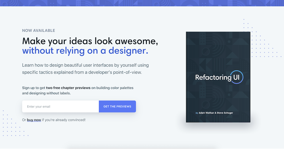
Above-the-fold opt-in form? That's different!
Traditional conversion tactics say that your sales pages should never link away from your website or encourage the visitor to do anything that isn’t buying. That’s why many sales pages don’t have a menu header.
Yet, this sales page has an opt-in form above the fold. But the reason why makes sense: The offer is to get 2 free Chapter Previews.
This is not an open-close product, so there is no incentive for a visitor to buy immediately. By offering chapter previews, Refactoring UI can attract qualified leads who are considering their products and then email them directly about their paid product.
No doubt there is a follow-up sequence of emails that shows their expertise and drives that email traffic back to the sales page again.
Expertise Examples
One thing that’s very unique about this sales page is that it doesn’t feel like one, not until a fair way down the page.
After the Opt-In Form, followed by an introduction to the team, the page then delivers value first with a short UI Design tip:
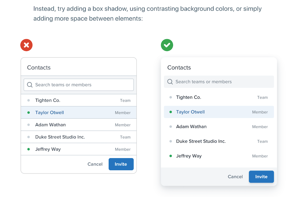
One simple graphic shows that they know their design strategies
When most sales pages scream ‘buy-buy-buy’, this one prioritizes value first. And it feels refreshing!
Before a visitor is even aware that there is a product to buy, they’ve had a quick-win nugget of knowledge and want to learn more. It’s the perfect segue into the product.
Pricing Table Emphasis
Have you seen those frustrating pricing tables that scream “Most Popular!” on the highest priced tier? I bet you immediately think: “Pffft… As if the highest price is the most popular!”
I never buy into it. It feels like a cheap way to grab for more money.
So it should come as no surprise that UI experts have a far more subtle yet compelling way to showcase their highest pricing tier. Check out their pricing table:
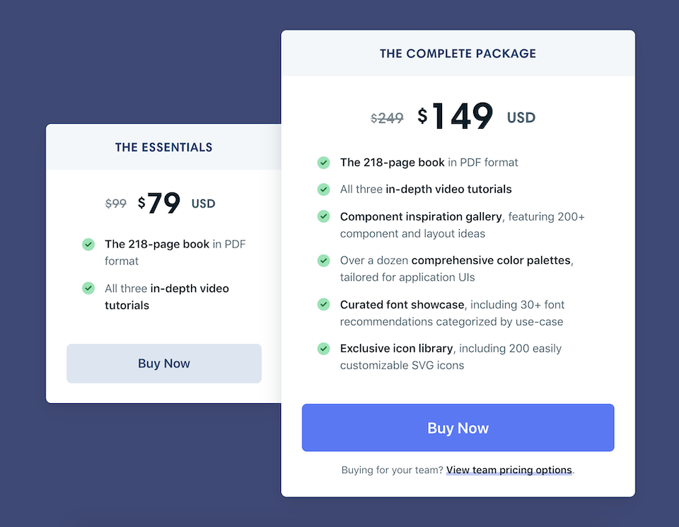
It's subtle, but this is a beautifully designed pricing table.
Look at the design differences:
- Higher priced offer is physically taller and wider
- Soft shadow implies higher priced offer is overlapping and closer to the viewer
- ‘Buy Now’ is colored on the higher price, but greyed on the lower price
- More green ticks and listed bonuses are shown in the higher price tier
These are classic pricing table strategies done expertly, even for a product that is less than $150.
Key Takeaways from Refactoring UI
> Not Rules, Guidelines: Although most sales pages follow the same patterns, that doesn’t mean yours has to. Feel free to change it up, but at least think through your reasons why.
> Deliver Value On The Page: If your sales page feels too ‘salesy’, try to find ways to provide value to your audience on the page before you really push for the purchase.
6 Low-Price Sales Pages Side By Side:
Now let's compare these sales pages side by side, to see what commonalities and differences they all have.
Smart From Scratch | Hearts in Harmony | 4K Camera Guide | Advertising Workshop | 90 Day Bikini Plan | Refactoring UI | |
|---|---|---|---|---|---|---|
Price | $249 | $29 / $198 | $79 | $49 | $19 | $79 / $149 |
Sales Page Video | ||||||
Buy button above the fold | ||||||
Course closing scarcity | ||||||
Box Shot (image) | ||||||
Testimonial Count | 2 (video) | 5 | 1 | 7 | ~20 | 3 |
Multiple Price Tiers | ||||||
Money back guarantee | ||||||
Permanent Discount |
The Perfect Sales Page Structure For Your Low-To-Mid Priced Online Course:
Based on all the research made for our first premium priced online course sale page post, we made a blueprint for the ideal sales page structure. But that was for products priced $500 - $4000.
The question is: does that same structure apply for low priced courses?
The answer is Yes (mostly).
Sure, there are a few notable differences between low vs high priced products. We do see a few ridiculously long sales pages for expensive courses, but none too long at lower prices. We also see way more testimonials used when prices get higher.
But for the most part, the sales pages use the same structure -- and it's been like this for years. And here it is all boiled down into a new blueprint to help you sell your online courses priced below $250:

Want it as an editable template? Check out the Bonus section below!
The key differences between this blueprint and the higher priced blueprint are:
Aside from that, the structure is pretty much the same!
But... there's only one stand-out exception: None of the low priced courses had countdown timers, yet almost all of the higher priced courses did.
The low priced courses were available all year round (except one), yet almost all of the higher priced courses had a closing deadline. Interesting...
BONUS! New Template:
Good news. If you’re an online course creator and a Thrive Architect user, you’ll be pleased to know that we've just released a brand new, beautifully designed Sales Page template specifically for online course creators that follows these exact blueprints.
With a few clicks you can open this template on your website, follow the steps and be ready to sell your course. Each section is pre-made for you and it has some amazing features that you're going to love.
Check it out here, because it'll knock your socks off!
But for now, I'd love to know: has this post raised any other thoughts or questions for you? What was the most interesting take-away? Let us know by leaving a comment below!


what a superb article! so much info and value. cheers Brad!
Thanks Ed
Bradley this post is awesome!! Very in depth look at some great sales pages. Can’t wait to see and likely use the new template!
Glad you liked it, Jonas. The new template is awesome. Can’t wait for you to see it
Really great article, very well done. Thanks for all the specific information, ideas and direction. Perfect timing too, as I need to work on a new sales page very soon (my first *real* one… gulp!)
One small suggestion that would have made it a bit easier to glean every last bit of information would be to make the screen capture images (which are fantastic real-world examples), clickable to enlarge in a lightbox or something. On my laptop (and with my eyes! LOL), I couldn’t read some of the subheadings. It was worth opening them in another tab to get the full info, but knowing that it could be made easier (and that Thrive Architect makes it easy to do)… just a thought 🙂
Good point. I thought about that, but figured I was providing the page link for people to see it live if they needed. But you’re right: since it’s so easy to add lightbox images, I should have done that. Will on the next one!
great content, thanks.
You’re welcome, Jago
Awesome post! – I’m biased because I was one of the ones asking about lower priced courses.
I can’t wait to see the new Thrive Architect template and in the meantime have another question:
If lower priced course pages don’t usually have a countdown timer…
What do you think about using evergreen urgency timers for say, discount codes for first-time visitors, ala Thrive Ultimatum? (I’m talking in the $50 – $70 price range)
Good question. Although lower priced courses don’t often have countdowns, that doesn’t mean it wouldn’t improve sales. But I think the general thinking is that there’s less resistance to a lower price, so it doesn’t need the scarcity. If it’s a great product at an even greater price, people might buy thinking “why not?”
That said, any kind of limited first-time discount will get more people taking action. Give it a shot! Nothing to lose, I say
Fantastic value as always and I can’t wait for the template!
I think you’ll love it!
Okidoky
Brad, this article is AMAZING! Thank you for breaking every webpage down into bite-size teachings. You make an overwhelming task of creating a sales page actually doable. Thank you!
It’s one of those things we take for granted… until you have to make your own sales page. There was much more to it than I first thought, that’s for sure.
https://thrivethemes.com/low-priced-sales-page-formula
Does this link work?
Ah, I made a mistake in the WordPress backend. Thanks for bringing that to my attention. I’ve set up a redirect so it should gets you to the right place (this page) now 🙂
Looks great, and love to see the new sales pages template that is coming.
You’re going to love it!
Hey Brad,
What an informative and amazing post. This almost makes me want to create a course right now 🙂 However, I’m still in the process of finishing a series of ebooks and reading this post has made me wonder if this blueprint also applies to ebook sales pages? Or are there any other posts out there talking about sales pages that aren’t for courses?
Thanks again for this great post,
Seraina
I think it depends on your topic and what your ebook is about. If it’s a narrative ebook, then I’d say no. If it’s a substantial info product similar to an online course but wrapped up as an ebook instead, then this blueprint is still a good starting point.
Look closely at the Refactoring UI example, since that’s an eBook with additional video content if you purchase the higher tier. We haven’t explored sales pages for other products as much as we have in these 2 articles, but Thrive Architect does have a bunch of different sales page templates built right in, good for a variety of different products.
This is fantastic. Hats off to everyone involved. Thanks.
You’re welcome, Tom
Very nice, very valuable and a very informative article. Not just words explaining something, but examples with real websites and pictures. Thank you for this amazing tutorial!
Glad to hear it was helpful, Vladimir
Hi
Thanks for this great informative post. love to see your upcoming template.
Upcoming template is already out!
Thanks for your reply. Can you post me a link to the template
I did. I linked you to the post in my last comment. Click the text that said ‘already out’.
Thanks.. Got it..
Awesome content. Two questions. How do you know that these sales pages are converting well? Also, how do a sales page (focusing on online courses) different from a service page?
Thanks! We don’t have exact numbers for these pages, so we can’t know how well they convert or what kind of differences would lead to a higher converting page. But the performance of the pages can be estimated by some factors. In some cases, the course creators have published information about how much a course launch earned them or publish income reports like Pat Flynn does. Another indicator is if a business has been around for a while and a product has remained on sale and is being discussed in various places online. We can’t know exact performance numbers, but there’s a clear difference between a “dead” sales page and one that’s generating sales.
For services, I’d say it’s similar to the difference between high and low priced courses. Many factors will be the same, but a good service based sales page will have its unique details. We’d have to do another deep dive to give a full answer on this, though. 😉
This is an AMAZING article. It gives and answers exactly what I was looking for. Thank you so much.
I’m pleased to hear that, Michal. It was a beast of an article to research and write!
Hi Brad, this post is dated September 2022 however the template is from a post in 2019. Is there a new template or the same one repurposed? Just want to make sure I’m not missing anything!
Hi Kim,
The template has also been updated to include the latest improvements in Thrive Architect. The latest versions are called “Online Course Smart” to reflect the smart color tech the template is using.
Thank you. Perfect timing. Just about to do my course sales page and will be using the new template.
Two words – “WOW” & “THANKS”
fantastic article.
Hi Bradley,
Thank you very much for this hammer post! Written easily and comprehensibly, full of valuable examples and super practical instructions.
I am thrilled, have understood a lot of things about sales pages better and love to implement it – of course with Thrive Architect.
Regards
Karin
PS: As I can see from the comments, the article is older, but I would like to say: it is more relevant today than ever!
Thank you Karin! Yes, I wrote it some time ago, but we felt it was still very relevant, and so we gave it a refresh and bumped it back up the blog. Glad you’re getting value from it!